Blog /
Analyzing mobile campaign metrics with the Purplegator Dashboard

How did my campaign perform? Purplegator Dashboard
Introducing the Purplegator Dashboard for mobile display and banner campaigns.

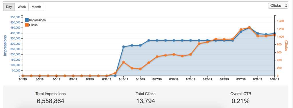
“How did my mobile campaign perform?” With the Purplegator Dashboard, you can easily download a variety of data and metrics, charts and graphs into PDFs that can be printed or emailed. Most of the data can be downloaded into .csv files for further analysis.
Beyond the basic performance metrics such as total impressions, total clicks and click through rates, with Purplegator’s Reporting Dashboard you can do your own deep dive into various metrics including:
Performance – summary data within preset or your own selected date range
Ad format – which ad size delivered the most impressions and clicks
Frequency – the number of times an ad was delivered to a viewer.
Conversions – what actions did people take after seeing the ad? We highly recommend that you add a conversion pixel to your website so that you can measure post click and post impression conversions – actions people take after they see your ads
Creatives – which image delivered the most impressions and clicks? Providing creative in all 7 sizes ensures that your ads will fit the publishers’ requirements and will deliver properly on various devices
Geography – which location(s) delivered the most impressions and clicks
The designated geo for your mobile ad campaign can be the entire state or nation, your competitors’ locations, a sporting venue or a parking lot – anywhere your best customers and prospects are and where our technology can capture their device IDs.
Categories – what ad categories (sports, news, health and fitness, games, etc) had the most impressions, clicks and click throughs
Browsers- identify which browser someone was using when the ad was delivered (Internet Explorer, Chrome, Safari, WebView). You can also learn which operating system was being used: IOS, Android, Linux, or windows phone and also which devices accessed your ads – Desktop, mobile, tablet or connected TV.
Time and Day – Evaluate what time of day and day of week served the most ads.
Behavior and Interest – Discover what behaviors & interests drove the most engagement
Web Sites – see the sites where your ads were delivered.
To summarize: the Purplegator Dashboard allows advertisers an easy way to view and analyze various data and metrics for their campaigns and to share that data with others.


